The Fitbit Luxe is compact, but maybe too much for me.
Scott Stein/CNET
First off: I'm not sure the
Fitbit Luxe
is for me. Literally. The small-screened $150 tracker, now available, is one of several band-type Fitbits on sale at the same time. The Luxe may be best for smaller wrists. Mine are big and hairy. And the Luxe is clearly aimed at being slotted into jewelry-like accessories, more like Fitbit's long-ago tracker, the
Fitbit Flex
.
Things have changed a lot since the Flex days. The Flex was basic and had no screen. The Luxe is a complete package, with heart-rate tracking, a color touchscreen OLED and five-day battery life. Sounds promising, and if you're looking for a general do-it-all Fitbit band that's as slim and good-looking as possible, this is it. But don't expect it to be easy to control.
Get the CNET Daily News newsletter
Catch up on the biggest news stories in minutes. Delivered on weekdays.
Read more:
Our full Fitbit Luxe review
The Luxe (left) next to the Fitbit Sense (right).
Scott Stein/CNET
The Luxe is too minimal for me. There's only that small touchscreen, no physical buttons. That means all navigation is done by tapping and swiping, which gets tiring. There's a lot the Luxe can do: track workouts, do guided breathing meditations, start timers or a stopwatch, set alarms, check phone notifications. But this all means swiping and swiping and swiping some more. No physical back button means it's sometimes hard to just return to the main clock display.
So small.
Scott Stein/CNET
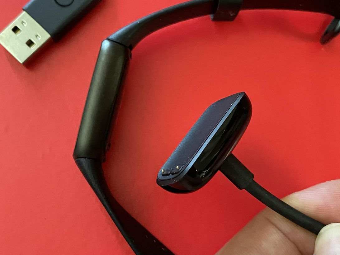
My first early preproduction review unit had a really defective touchscreen, but the final production model I tried afterward is much improved. Still, it feels awkward. And to reset the Luxe in case of a problem, you need to press a button on the (completely proprietary and unique to the Luxe) USB charging dongle three times. It feels like a magic spell in a bad way.
There are a number of good-looking watch faces (twenty and counting) you can download from the Fitbit app, but they look really small on the already-tiny display. The color screen is inset from the already-thin band with some thick bezels. Stats like heart rate and steps taken feel almost microscopic.
The charger: Another proprietary dongle!
Scott Stein/CNET
After five days or so (before recharging), the band is comfortable and almost invisible to wear. Sleep tracking and heart-rate data looks solid, and I appreciate the all-inclusive features. But there's stuff that's been left out. No Fitbit Pay, no GPS, no elevation tracking, and none of the apps or higher-end sensor data that the
Fitbit Sense
has (and you probably don't need).
Fitbit's app remains really good, although with Fitbit being acquired by Google (and leaning more on a subscription-based Premium service for extras that you may not need), it's hard to tell where the Luxe fits into where Fitbit's heading next. Fitbit has added a fast pairing mode for Android users, and Fitbit's tech is slowly entering
Google's Wear watches
. But is the Luxe a sign of Fitbit's future, or of its past?
Scott Stein/CNET
The Luxe is best treated as more of a screen-enabled modern version of a
Jawbone
tracker (remember those?): Wear and forget about it, use the screen features only if necessary. For a tracker you can really control better, I'd recommend the
Fitbit Charge 4
or the Fitbit Inspire 2, both of which cost less. And if you're excited enough about Fitbit's fancy accessories (leather and metal bands) to want to make this your tracker of choice. But a deeper review is coming; for now we're just trying to help you decide if you're Luxe-curious.
The information contained in this article is for educational and informational purposes only and is not intended as health or medical advice. Always consult a physician or other qualified health provider regarding any questions you may have about a medical condition or health objectives.
