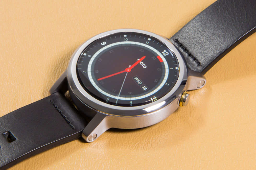
The 2nd Generation Moto 360.
Ron Amadeo
reader comments
94
with 66 posters participating
Share this story
Share on Facebook
Share on Twitter
Share on Reddit
Without a "Nexus" smartwatch on the market, the Moto 360 has always felt like the flagship device for Android Wear. It was
the first watch announced
, the first with a (mostly) round display, and it was the best looking of the Android Wear watches for a long time.
But while on the outside it was the best Android Wear device, on the inside it was the worst one thanks to the seriously dated Texas Instruments OMAP 3 processor. The result was a good-looking, slow smartwatch that would often be dead before the end of the day.
For the second generation Moto 360, Motorola set out to right the wrongs of the past version. The crusty OMAP has been swapped out for a modern Snapdragon 400, which not only greatly improves the speed, but it bumps up the battery life, too. Motorola has also elevated the device's market-leading design; the 360 is now part of Moto Maker, meaning it has tons of customization options. Even size can vary, as the second generation brings a more compact 42mm version and even a smaller version marketed specifically toward women.
Moto Maker: For wearables, customization is a killer feature
The first step of Moto Maker is to pick the case size. Here's the 42mm men's version.
The women's version has smaller lugs with a smoother lug design.
You can also still get the big, honkin' 46mm version if you want.
The bezel can be customized with a color and a style. The men's version offers a chamfer or a diamond knurling pattern.
The bezel on the women's version offers a "peak" shape or a micro cut pattern.
Here's the "peak" option, which seems to be a v-shaped bezel.
There's an option for case colors, too. Here are the women's choices.
And here's the men's body color options.
There are a few band options. We like the metal the best.
The women's version has a choice of metal or leather, and there's even a "double wrap" version.
There's also the option to pick a watch face, which can be changed at any time.
We tended to go with matching designs, but nothing has to match if you don't want it to.
Prices range from $299.99...
...to $449.99 with all the options.
Here's the full list of configuration options.
SPECS AT A GLANCE: MOTO 360 (2nd Gen)
SCREEN
42mm: 1.37" 360×325 LCD (263 PPI)
46mm: 1.56" 360×330 LCD (233 PPI)
OS
Android Wear 1.3 (Android 5.1.1-based)
CPU
1.2GHz Qualcomm Snapdragon 400
RAM
512MB
GPU
Adreno 305
STORAGE
4GB
NETWORKING
Bluetooth 4.0LE, Wi-Fi 802.11 b/g
CASE SIZE
42mm or 46mm × 11.4mm
BATTERY
42mm: 300mAh
46mm: 400mAh
PRICE
$299.99-$449.99
OTHER PERKS
optical heart rate monitor (PPG), dual microphones, IP67, ambient light sensor
The first step in purchasing a Moto 360 is to actually
design
one. While Motorola's customization website, Moto Maker, has been around for its phones for some time, this is the first time the company has done any real customization for a smartwatch. For watches, Moto Maker feels like a much bigger deal than it does on a phone. It's a fashion item. A smartwatch is something you have to actually
wear
, so, for many people, how it looks is a primary consideration for purchasing one.
Manufacturers have started to catch on to this idea—the
Apple Watch
, for instance, comes in several different materials and band types—but no one offers the level of customization that Motorola does. There are even "men's" and "women's" versions of the watch with difference focused mostly on size. The men's version comes in a 46mm and 42mm body, and the women's version comes in 42mm. You can pick the color of the body and bezel, and there are several treatment options available for the bezel, like knurling or a chamfer. You can also pick from leather or metal watch bands. The band is easily changeable now, and Motorola has lined up third parties to make additional bands.
Regarding the sizes, the men's and women's 42mm watches are functionally identical, but there are component differences between the 42mm and 46mm watch bodies. The 42mm body has a 1.37-inch, 360×325 LCD and a 300mAh battery, while the 46mm version has a 1.56-inch 360×330 LCD (yes, five more lines of resolution) and a 400mAh battery. The men's 46mm version gets paired with a 22mm band, the men's 42mm version uses a 20mm band, and the women's 42mm version gets a 16mm band. The women's version also lacks the round embellishment on the watch lug, which Motorola says gives it "a sleeker look."
Advertisement
Every watch body is made of "aircraft grade" 316L stainless steel, but there are several color options available. The men's version comes in silver, black, and gold, while the women's version comes in silver, gold, and rose gold. The body and bezel can be colored independently, so if you want a black bezel with a silver case, that's totally possible. The bezels have treatment options besides colors as well. Men can pick from a chamfer or "micro knurl" pattern while women can choose from "peak" or "micro cut."
The bands come in the usual metal and leather options. The metal options are available in the same color as the watch bodies, but you don't have to make them match. For leather, the women's version comes in "Blush"—which seems to match the rose gold color—or gray. There's also a double wrap leather option for the women's version. Men's leather bands come in black and brown. Moto Maker also lets you pick a watch face, which is good for visualizing what the watch will look like, but functionally you can change the watch face at any time, so it's not a big decision.
The amount of customizability is hugely important. Wearables aren't just about spec sheets and benchmarks. As
we saw with Google Glass
, how it looks and how you feel wearing it can be a deal breaker for many people. With over 300 possible combinations, the second gen Moto 360 has a good shot of being something you can feel comfortable wearing out in public.
For the record, we picked a men's 42mm silver body with a chamfered silver bezel and black leather band (only because we couldn't get a steel band). All of our impressions and battery experience are of this version.
Design
I have a small wrist, and this actually fits!
On the back are the usual "ring of specs" and a very finicky heart rate monitor.
The side button has a nice little Motorola logo on it. Unfortunately, it can freely rotate. The green light is the heart rate monitor taking a random measurement.
The Men's version has a circle design on the end of the lugs.
On the side is a microphone port and a slot for... assembly?
The Gorilla Glass top sticks out of the watch body a bit, and it has a nice beveled edge.
The 263ppi display on our 42mm version looks great.
What doesn't look that great is the low-resolution mode it drops down to when the watch is "off."
The screen still isn't totally round—there is a "flat tire" shape.
On top of the dead section of the display is an ambient light sensor, and internally it's where the display wires exit the LCD.
We think this is a better design than the totally round Huawei Watch because, well, look at how much more compact it is.
Here's the leather band that came with ours.
The band uses a normal watch pin for the band, but the special Motorola bands have a quick release switch that makes things easier.
A close-up of the switch.
Here's the band disconnected. That's a normal watch pin.
The leather band is "Horween" leather from a tannery in Motorola's home town of Chicago.
The clasp is just a normal watch clasp.
Here it is charging. The 360 kicks over to a desk clock mode.
The charger looks like the old 360 charger but with a few tweaks.
One of my first impressions after strapping on the 42mm Moto 360 is that it actually
fits
. The new 360 is one of the most compact Android Wear devices available, and on a smaller wrist like mine that makes a big difference.
New to the 360 design this year is the exposed lugs—little arms that stick out of the body and hold the watch band. The old 360 had internal lugs, which made it extremely hard to swap out the band. With the external lugs, a little switch on the underside of the band lets you easily engage and disengage the band from the watch. There doesn't seem to be anything proprietary here, just a normal watch band pin with a fancy release mechanism. We were able to fit a 20mm generic band to our 42mm 360, and it worked just fine.
The new Moto 360 display still has the flat tire shape that the original was known for. This dead area of the screen is used to store the display circuitry and ambient light sensor while keeping the bezel as thin as possible, and we think the tradeoff is worth it even if it doesn't always look great with all watch faces. If you use a dark watch face, the flat tire is something you stop seeing pretty quickly.
Advertisement
The Huawei Watch notably avoids the flat tire look while still keeping the bezel thin, but the Huawei Watch moves the components in between the watch lugs. This isn't a huge deal on larger wrists, but it makes the device less compact than the 360. In the gallery above is a comparison of the 360 and a Huawei watch. You can see that, on my wrist, the 360 fits way better than the Huawei Watch because of the more compact lugs.
The display looks great when it's on. The 263ppi LCD is sharp enough to look like a nice display face and not a bunch of little squares. However, this illusion goes away in the "ambient" mode, when the watch is asleep. Android Wear forces a low-resolution mode on the display, and it looks like a blocky mess.
The side button on the 360 has been moved from the first version. Originally it was at 3 o'clock, but on the second generation 360 it has moved to 2 o'clock. Motorola says the change is to stop people from accidentally hitting the button with the back of their hand. On the button is a little Motorola logo, a nice touch, but we were disappointed to see it's not locked in an upright position. It's free to spin around, which means most of the time the logo won't be upright.
Video shot/edited by Jennifer Hahn
On the back of the watch is the usual heart rate monitor. A small lens will occasionally (or on demand) blast out a green light and attempt to read your heart rate. Like many of these "green light" heart rate monitors we've seen on watches, fitness devices, and Samsung phones, this thing is a piece of junk (the
Apple Watch
being one of the few exceptions). The green light is supposed to pass through your skin, hit your blood, and be reflected into a sensor on the back of the watch, but any movement of your arm or the watch will produce an inaccurate reading.
It's possible to get an accurate reading out of it, but you have to sit perfectly still—something that will never happen during the periodic, unannounced readings that it does automatically. For on-demand readings, it's so finicky that we would always take two to three readings to come to some kind of consensus. You also only ever get a snapshot of your heart rate; wearing this all day won't give you a graph of your heart rate or anything.
Even then this is only really good for your resting heart rate. Taking a reading of your active heart rate during a workout is less doable thanks to how long a single reading takes (about five seconds), and you have to sit very still during it (a lot harder to do with a high heart rate). Again, it's so finicky you'll probably want to do it a few times.
The charger remains a wireless Qi-powered watch stand that kicks the watch over to a clock display mode. It looks a lot like the old 360 charger, save for two ridges in the bottom of the dish that holds the watch. At Motorola's launch event, we were told the new and old chargers are not compatible, but we were able to charge the new 360 on the old stand and the old 360 on the new stand just fine. As a fun bonus, you can now swipe across the clock display mode to cycle through colors.


