Robert Triggs / Android Authority
The general consensus is that
Samsung
‘s smartphone software is in a pretty good state these days. One UI 3.0 is feature-rich but not too bloated, with one of the
industry’s best update promises
in place. But Samsung’s software hasn’t always been looked upon so favorably, particularly for those who have been around long enough to remember TouchWiz.
If you’re interested to see how Samsung started out in the mobile industry or simply how far the company’s software features have come, join us as we whip through the evolution of Samsung’s smartphone software.
See also:
The evolution of OnePlus software: Cyanogen to Oxygen, and beyond
The early TouchWiz days
While TouchWiz is thought of as synonymous with Android, Samsung’s smartphone software skin actually started out in the pre-smartphone era. TouchWiz 1.0 shipped with the Samsung Solstice in 2009, followed up by version 2.0 for the Solstice 2 in 2010.
TouchWiz was already in its third generation by the time it was married with Google’s
Android OS
. TouchWiz 3.0 launched on the original Samsung Galaxy S back in 2010. Right off the bat, Samsung took a very different approach than stock-Android, building heavily on Google’s feature set and offering a unique look for its skin. For example, early TouchWiz supported rearranging home screens, custom shortcuts, and a selection of custom widgets that weren’t found on other handsets. Widgets really were the name of the game back then.
Samsung Galaxy S series:
A history of the biggest name in Android
Samsung continued to refine TouchWiz with version 4.0 for its breakout Galaxy S2 smartphone, based on Android 2.3 Gingerbread, followed up by the equally impressive Galaxy S3 Android 4.0. Cutting-edge features kept on coming, including gallery and browser gesture controls, the S Voice assistant, picture-in-picture, and split-screen app view.
Samsung also changed up its naming scheme and the look of its skin with TouchWiz on the Galaxy S3. The GUI took on a sleeker, greener appearance with the newly named “TouchWiz Nature UX” interface. One of the UI’s notable introductions was an interactive ripple water effect on the lock screen. That probably sounds daft now but was quite the novelty back then.
While these two smartphones were very well received and kickstarted Samsung’s smartphone ascendancy, the tell-tale signs of feature creep were beginning to appear. In addition to Google software, Samsung shipped its flagship phones with a growing range of in-house apps, such as ChatOn, Social Hub, Music Hub, and others.
TouchWiz Nature UX 2.0: The feature creep begins
With the switch to TouchWiz Nature UX, Samsung began making a wider range of UI tweaks in time for UX 2.0 and the Galaxy S4. The company introduced some interesting innovations like eye-tracking to auto-scroll web pages. But Samsung’s penchant for features started to grate on reviewers, who criticized the phone for a range of gimmicks and bloated features, such as Air Gestures, Smart Pause, and S Translator — not forgetting an increasingly hard-to-navigate settings menu.
TouchWiz Nature UX wasn't just a heavy Android skin, it was heavy on extra features too.
Samsung continued to jam a mixture of features into subsequent software revisions. Samsung Knox security made its full appearance with Nature UX 2.5, as did a one-handed mode for the Galaxy Note 3. Nature UX 3.0 trimmed down the UI and decluttered the settings menus a little in time for the
Galaxy S5
. But Samsung couldn’t resist adding in the floating Toolbox app menu and My Magazine news aggregator to its skin.
Samsung returned to its traditional naming scheme with TouchWiz 5.0 for the
Galaxy S6
. And with a new hardware design came a refreshed approach to software. Samsung ditched its noisy UI sounds, simplified various settings, and decluttered its icons for Multiwindow and Toolbox. Samsung also removed some of its less necessary apps and took greater inspiration directly from Android Lollipop, although TouchWiz’s bolder color UI elements remained.
TouchWiz quite rightly earned a reputation for feature creep, but Samsung eventually took notice. Samsung continued to tidy up its software with TouchWiz 6.0 and TouchWiz Grace UX, leaving the Galaxy S6 and S7 in a better place by the time Samsung finally moved on to its next UI project.
Samsung Experience
With TouchWiz no longer recognizable from its early iterations, software designed for the
Galaxy S8
became known as Samsung Experience. Samsung Experience ran on top of Android 7.0 Nougat and 8.0 Oreo, and made its way to a wide selection of Samsung smartphones across various price points.
The new-look GUI revamped Samsung’s color pallet and icons, resulting in a much more up-to-date and polished look that shared more in common with Google’s vision than ever before. Samsung retained a fair amount of customization though, including Edge UX elements from the Galaxy S6 days, always-on display functionality, its game launcher, and other existing elements. Even the back button was swapped to the right-hand side rather than the left, as per Google’s stock OS.
Samsung Experience introduced the
Bixby virtual assistant
as a core part of Samsung’s ecosystem for the first time. The software also debuted
Samsung Dex
, transforming the Galaxy S8 into a portable PC work environment — although neither of these features really took off. Subsequent updates to Android Oreo made small changes and improved several features, such as Bixby 2.0 and Secure Folders, but the experience was mostly the same as the original release.
Samsung Experience introduced the controversial Bixby virtual assistant.
Samsung learned its lessons with TouchWiz. Users had much more choice about the features they wanted to actually see and use with Samsung Experience. While still busier than “stock Android” that pundits seemed to love, Samsung’s heavier UI continued to help define its Galaxy smartphone series.
One UI and the modern day
C. Scott Brown / Android Authority
With Android 9.0 Pie, Samsung once again switched up its UX naming scheme. The Samsung Experience 10.0 beta became One UI by the time it debuted with the
Galaxy S10 flagship
. Once again, Samsung tweaked its user interface, making it cleaner and more user-friendly than previous iterations. In fact, ease of use for larger displays is one of the key drivers behind
One UI
. Samsung tweaked its menus and apps, moving key UI elements within thumb’s reach.
One UI has vastly improved Samsung's balance of custom features and ease of use.
One UI retained most of the features available in Samsung Experience. Dex was further improved, a system-wide
dark mode
was introduced, and button navigation could be swapped out for gestures. Clearly listening to user feedback, a single press of the Bixby button could be reassigned to new functions too.
One UI 2.0 moved on up to Android 10, adding in a Samsung skinned version of Digital Wellbeing, Wireless Dex in 2.5, some minor UI tweaks, a Dynamic Lock Screen, and a few other bits and pieces. But the look and feel of Samsung’s UI remained virtually unchanged and the skin has become rather good at finding homes for all these features.
Worst to best:
The Samsung Galaxy S series, ranked
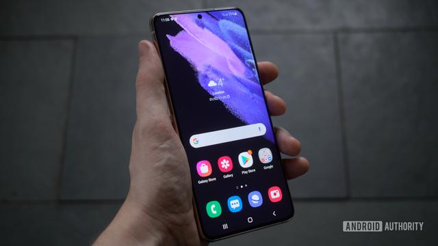
At the time of writing, One UI 3.1 is the latest version of Samsung’s skin — with a few modest changes from the original version. The notification panel is now translucent, there’s a new volume control positioned on the right side, and Samsung smoothed out animations across its UI. But overall it seems that Samsung and its customers are quite happy with the state of One UI over the past three years.
From TouchWiz to Samsung Experience and One UI, Samsung’s take on Android has always been at the cutting edge of the latest features. In the past, TouchWiz was ridiculed for its bloated approach to software. But the truth is that Samsung hasn’t really dialed back its love for new features and options. Rather the company has become much better at refining the core UI experience, leaving adventurous consumers to explore all Samsung’s bells and whistles on their own.
What do you think about Samsung’s UI journey? Do you have a favorite skin era from a classic Galaxy handset? Let us know in the comments below.
Features
Samsung
,
Samsung One UI
,
samsung software
Comments
