Most people associate Razer with gaming laptops, mice, and other hardware. But at CES 2014, the company unveiled plans to enter the fitness tracker / smartband market with
the launch of Nabu
, a black wristband that combined basic fitness tracking features with an OLED screen for displaying notifications. One year later,
Razer returned to Vegas with the Nabu X
and ditched the screen in favor of three LED lights and a much lower price tag.
The original Nabu never really saw a proper commercial rollout, but the Nabu X is now very much on store shelves, and it’s cheap. You can pick one up for $50, and Razer is currently running a two-for-one promotion that basically puts a $25 price on the thing. Is low cost alone enough to make the Nabu X a worthy buy in a crowded field of competition? No, not quite.
The Nabu X has what I’d call an inoffensive and unthrilling design. It’s a boring (though comfortable) band covered in black silicone rubber. This has the unfortunate side effect of attracting lint and dust within minutes. The smartband is no fun to clean off by hand, but thankfully it’s water resistant so you can just run it under the sink. Unlike the awful clasps we recently saw on the Jawbone 2 and 3, this one is dead simple; there are two teeth that go into holes on the one-size-fits-all strap. You can easily strap the Nabu X on with just one hand, and it never came loose during my testing. I wore it both day and night.
Charging it is pretty inconvenient, though. Since the Nabu X uses a proprietary port, it’s yet another cord to carry around in your bag. Thankfully you won’t have to bother with that very often; Razer’s smartband easily lasted a week before its battery finally gave up. And while proprietary connections are always annoying, this one is at least very secure and won’t accidentally come unplugged.
Inside the Nabu X is a 3-axis accelerometer that it uses for step counting and to track your overall distance each day. The smartband syncs with both Android and iOS via Bluetooth. Windows Phone support isn’t yet offered; Razer says this is because it’s harder to offer the same functionality on Microsoft’s platform.
Up front are those three round LEDs. They’ll light up whenever notifications come in on your phone, and you can also tap twice to get an update on your daily fitness goals (total steps, calories burned, etc.) or the band’s remaining battery life. I hate the tapping interface on Jawbone’s new Up trackers, and I don’t like it any better here. Buttons, please. It’s worth noting that many people have compared the Nabu X to Xiaomi’s dirt cheap Mi Band, and the link is valid. There are some clear aesthetic differences between the two, but fundamentally they’re very similar.
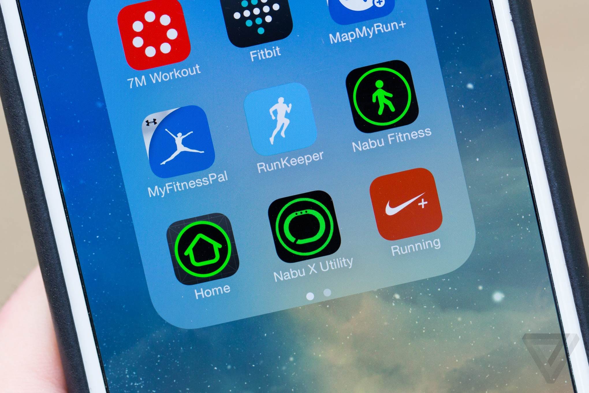
You'll need three apps on your iPhone to get the most from Nabu X
Razer’s whole vision for the Nabu X starts falling apart when it comes to software. To get the most out of the smartband on iOS, you’ll need to install three different apps on your iPhone. The first is Utility, which handles pairing with the Nabu X and shows critical information like remaining battery percentage. This is also the app you’ll use to trigger the band’s sleep tracking and set alarms. It works decently well as an alarm clock on your wrist. The vibration is so forceful that I can’t imagine anyone sleeping through it. Bizarrely, a separate Home app must be installed from the App Store if you want to view the Nabu X’s stats as a widget in your iPhone’s notification tray. For some reason, Razer couldn’t bundle this into the primary Utility software. And of course there’s the main Fitness app, which I’ll get to shortly.
But first let’s talk about the Nabu X’s strange focus on social features. Razer seems to think that a lot of people will be wearing its smartband someday, so it’s created something called "Pulse" technology that lets you shake hands with another Nabu X owner and instantly exchange contact info (Facebook or Twitter) and compare activity stats. Developers can also build smartphone apps and games that integrate Pulse and are capable of finding nearby Nabu X wearers. But not many are bothering at the moment, and the whole social end of this sounds like a pipe dream. If this were a product made by Jawbone or Fitbit with brand recognition and mass market appeal, maybe you could get away with it. But Pulse really just feels like a tacked on callback to Razer’s gaming roots.
Where'd that notification come from? Who knows
And then there are notifications. To signal that you’ve received any type of alert, the Nabu X’s three LEDs will all light up with the same color depending on what kind of notification it is. By default, they’ll turn blue for incoming calls, red for alarms, and green for everything else. And I mean everything else. This is where using the Nabu X starts to become infuriating. There’s absolutely no way to distinguish what app notifications are coming in; you just know your phone has something for you.
Was it a Facebook message? Three green dots. An ESPN score alert? Same thing. Sure, it could just be Trivia Crack pestering me to come play again, but the green lights could also mean I’ve just missed an important email or text message. Without a screen and without text, there’s just no way to know. Sure, getting a vibration on your wrist is useful when your phone is sitting across the room. But if it’s in your pocket, you’ll be fetching it every single time, and that’s maddening.
Filtering which notifications come through on iOS leaves a lot to be desired. Don’t want your wrist to vibrate every time a calendar alert goes off or an email comes in? You’ll have to disable those notifications across all of iOS to make it stop. Things are much easier on Android, where you get full control over precisely which apps the Nabu X will bother notifying you about.
On the fitness side of things, everything here is just barely par for the course. Razer’s Fitness app will display your steps, distance traveled, and calories burned in real time. It’ll also remind you of how much sleep you got the prior evening. You can review these four stats in day, week, month, or year views. Razer includes your resting calories in the figure, so there’s no easy way of seeing how many you’ve actively burned. Another tab lets you set daily goals, but the app offers zero guidance on what you should be aiming for. Don’t expect anything close to what competitors like Jawbone offer; that company’s Up smartphone app basically becomes your own personal fitness coach. On the plus side, you can export the Nabu X’s data to at least one popular service, MapMyFitness.
Ditching the display was a mistake on Razer's part
Throughout my testing of Nabu X, I arrived at this question: what’s the point? If you’re after basic step tracking, both Google and Apple now offer their own (free) software on Android and iOS, respectively. Google Fit and Apple Health are more than capable of providing you with a basic overview of your daily activity. So can Jawbone’s $50 Up Move — and the app you get with it is great. I’ll cut Razer some slack for being newer to this game, but going with anything from Jawbone or Fitbit is nonetheless a smarter move. And if you want notifications on your wrist, get an Android Wear smartwatch, a Pebble, or the Apple Watch. The Nabu X’s confounding LEDs will only frustrate and stress you out. Razer’s smartband is definitely affordable, but I can’t see why anyone would need this product. It seems like the company started off with a better product than the one it finished with; leaving the screen behind was a mistake, even if the end result would’ve cost a bit more. But if history is any indication, Razer will be ready to try again at CES 2016.
