I lost my phone this morning.
Normally that’s impossible. My phone is always either in my pocket or in my hands, because missing an email or a text or a killer snap is just entirely unfathomable. But this morning, I was reading an email on my wrist, and walked out the door without even checking my pockets. That's what the Moto 360 has done to me: I already feel naked without it, but I don’t notice my smartphone so much anymore.
The Moto 360 is the smartwatch I’ve been waiting for, the $249 timepiece that promised to be the first Android Wear device I’d actually want to wear. It’s designed to prove that smartwatches don’t have to be ugly. That they can, and must, be beautiful. That a smartwatch should be a watch, and that being a watch is ultimately the only thing that matters.
Motorola has said all the right things for months, but it’s time to put up or shut up. The 360 goes on sale today, and it does so under the watchful eye of the smartwatch industry. Everyone from Apple to Rolex to Swatch is looking on, waiting to see what happens next.
It’s go time.
Motorola never talks about the 360 as a gadget or a technological marvel. It’s not meant to be a computer on your wrist, a smartphone shrunk to a new form factor. It’s a timepiece. A wristwatch. That was the starting point, the founding idea — Motorola came not to create a new category but to evolve an old one.
It’s not a gadget, it’s a watch
It’s an ambitious goal, and Motorola pulled it off. The Moto 360’s most impressive feature is that I stopped noticing it almost immediately. Whenever I wear the
LG G Watch or the Samsung Gear Live
, I’m constantly compelled to fidget with it; there’s this unexplainable feeling of having something alien on my wrist that is there because I need to use it. The 360, on the other hand, just vanished into the spot left on my wrist by the Seiko watch that conveniently died this week.
There’s an understated elegance to this device. It’s utterly without flash or flair, but it’s classy as can be. Its leather strap, made by Chicago tannery Horween, is high-end and comfortable — and not just compared to the plasticky, rubber straps on other smartwatches. Its round, stainless steel shell (which comes in black or silver) sits neatly on my wrist, without sticking out off the sides of my arm and knocking against my desk or catching on my sleeve. It’s lighter than it looks (just 1.7 ounces), smaller than it looks, more comfortable than it looks. At 11.5mm, it’s a little thick for my taste, but it still feels good on my wrist. It feels like the watches I’ve always worn. It’s tough enough to wear in the shower or get dirty with, and I stopped worrying about it or fidgeting with it as soon as I got it working.
It’s the Jon Hamm of smartwatches
The centerpiece of the 360 is the 1.65-inch display that protrudes ever so slightly from its round shell. It runs almost completely edge to edge, encircled by only the smallest of bezels. The display has terrific viewing angles, and is easily (and surprisingly) viewable outdoors. It’s not a perfect circle, though, not quite — there’s a small cutout strip of black plastic at the bottom, which houses the device’s internals and sensors. It hurts the look a bit, but I hardly notice it anymore.
The screen looks great at a glance, but not under close scrutiny: its 320 x 290 resolution is low enough that you’ll see jagged edges on letters and can easily make out individual pixels, and the beveled edges of the Gorilla Glass give off a sort of shimmering moiré pattern. The edges almost glitter, making everything harder to read and just a little bit dirty looking. (It’s a fingerprint magnet, too, which doesn’t help.) It’s the only thing about the 360 that looks or feels cheap.
For a device you’re not likely to spend a lot of time looking at, this screen does its job fine. But a crisper display that sits flush with the bezel would feel even more immersive, more like a sapphire wristwatch. Motorola loves to talk about what an engineering accomplishment the round screen is, but there’s work left to be done.
Round is hard, though, and not just for Motorola. Google may technically support round displays with Android Wear, but the 360 provides constant confirmation that this operating system was designed with rectangles in mind. Scrolling through a list will often cut off titles and images; sometimes list items get kicked way down to the bottom of the screen for no apparent reason. As with the display, there’s nothing necessarily broken here; these are just small cracks in the armor that keep the 360 from feeling truly like a perfect, polished device.
There’s not much Motorola can do about it, either. For all its hardware prowess, the Moto 360 is functionally just like every other Android Wear device. This is Google’s platform, and it controls it tightly. That makes the 360, at its most basic, just a much more attractive way to see all the same notifications on your phone. New emails, texts, calls, tweets, weather information — everything pops up on your watch. In many cases, there’s also an easy way to respond without ever taking your phone out of your pocket. You can also perform basic Google searches, set reminders, take notes, and get quick directions to the nearest Starbucks.
Android Wear is the everything inbox
, and it’s the same thing no matter which device you’re shouting “Okay Google” at. (I should note, though, that the 360’s voice recognition seems to be even better than the other watches. It has two microphones built in, plus Motorola’s impressive software; it almost never misheard me.)
You can change the hardware, but you can’t change Android Wear
A few months in, there’s still really not that much you can do with Android Wear. Whenever I show it to people my demo almost always either ends in ten seconds (“look at all the watchfaces!”) or involves me forcing someone to text me so I can respond from my wrist. There’s a heart rate monitor and a pedometer inside the 360, but neither are terribly accurate, and they feel like only a gesture in the direction of how powerful a fitness device a smartwatch could be. Runtastic’s Android Wear app is handy, too, letting you start and track a workout from your wrist, but it’s not very powerful yet.
But that’s exactly the point: the Moto 360 isn’t meant to be used all the time. It’s meant to be a delightful and occasional source of useful information, reminding you at the perfect moment of the thing you forgot. You’re not supposed to ask Android Wear what’s next on your calendar; you’re supposed to trust that it’ll tell you when you need to know. And that it’ll direct you there when it’s time to go. All you have to do is say “Okay Google, call a car.”
That’s why smartwatch hardware is so important. Most of the time you won’t be using the Moto 360, yet it’s always visible. When it’s just hanging on your wrist, it better look and feel good. That’s what Motorola is getting at: the Moto 360 isn’t something completely new, something you’ll use for hours at a time like a phone or tablet. It’s a watch. You flick your wrist, check it, and go back to your life. This watch just happens to do more than tell time.
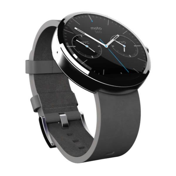
More often than not, you won’t be using a smartwatch — so it better look good
Until, that is, it doesn’t do anything at all. That happens about 12 hours after I take the watch off its charger, a cool black wireless dock that the 360 slots into sideways. Motorola says the 360’s battery lasts a day, but I haven’t seen it last that long yet. I don’t expect a smartwatch to last weeks or years, but it ought to be able to last a day and a night no matter how much I use it. My watch now dies before my phone does, and that’s unacceptable. I’ve already spent too much time wearing a dead Moto 360, and good-looking a bracelet as it is, that’s not what I’m spending $249 for.
As long as it’s charged, the Moto 360 feels different from any of its competitors. In many ways, it feels like the first
real
smartwatch. Everything before it was a screen on your wrist, a mini-tablet made to bring you easy notifications. Those are a warped evolution of computers, not watches. But the Moto 360 is to a sundial as the iPad is to a stone tablet: it’s the same, only completely different. Better. Swapping my Seiko for a Moto 360 involved zero cognitive effort, no idle touching of my wrist because it feels different now. It just fits.
But the best yet had better not be the best we can do. Motorola needs to figure out how to make the battery better, and how to do it without sacrificing style. It needs to release more straps, more colors, more options. If it wants to play in the watch industry, Motorola needs to offer variety. It needs to not be one-size-fits-all, because one size doesn’t fit all. (There are more leather and metal bands coming, but that’s not enough either.) And at some point, some company is going to have to up the smartwatch ante again. It might be Apple, it might be Google, it might even be Motorola. But whether it’s more powerful health features or just better notification management, we’re not even close to fully realizing what a smartwatch can do. We’d better not be.
If you’re buying a smartwatch today, spend $249 and buy the Moto 360. That’s an easy call. But buy it knowing that this is only the beginning, that looking good is only the first step toward being great.
The road ahead is still long for smartwatches, but the future looks better than ever.
Our review of
Motorola Moto 360
Verge Score
8.1
out of 10
Good Stuff
Gorgeous design
Great voice recognition
Round is the right form factor
Nice, interchangeable straps
Bad Stuff
Frustrating battery life
Round display causes some software awkwardness
Buy for $249.99
from Motorola
